The Changing Logos of Just Married
I just love a good iconic logo, don't you? I totally am a sucker for packaging, so I am definitely more inclined to buy something (whether it be conditioner or a magazine) if it has an aesthetically pleasing design -- including the logo. Readers of romance comics endured lots of changes to their favorite titles' logos as you can see with earlier posts on Young Romance and Time for Love. Today, let's take a look at how Charlton's Just Married logo changed over the eight years the title ran.
For over 10 years, from issue #1 (January 1958) through issue #62 (January 1969), the logo went unchanged -- a standard semi-blocky font with hearts making up the closed negative space on the letters a, e, and d:
Issue #63 (March 1969) brought with it a slight change -- a quadrilateral-shaped border around the title. This lasted until issue #76 (April 1971), shown here:
The next issue, #77 (June 1971) was the only issue of Just Married with the following logo featuring a heart dotting the i. What a shame! It certainly has a special little something about it, doesn't it?:
Next up is the logo for issues #78 (August 1971) through #107 (September 1975). Similar proportions were used as before, but an outline added and wedding bells replacing the heart over the letter i:
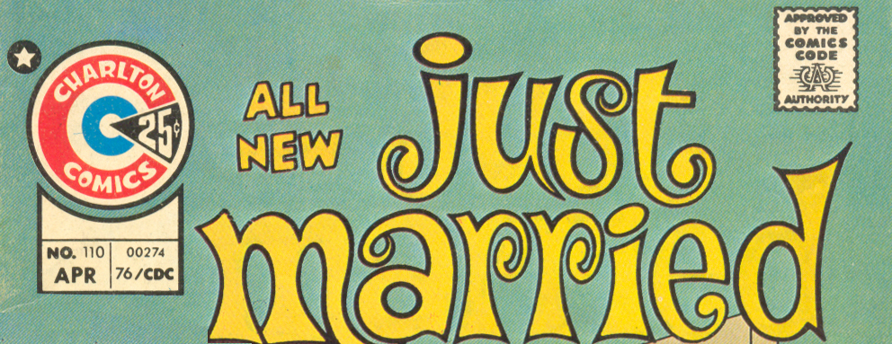
The next five issues, #108 (December 1975) through #112 (August 1976) ran with a more whimsical curly font for the logo:
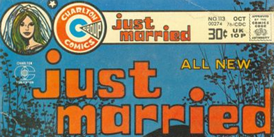
And last, but not necessarily least, the final two issues of the series, issue #113 (October 1976) and #114 (December 1976) went with a chunky block look for the the logo before calling it quits:
So tell me! Which one do you like best?


