
The Changing Logos of Time for Love
In my opinion, Charlton's Time for Love series has one of the more iconic logo sets. Take a look and see what I mean!
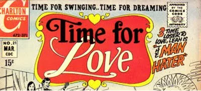
This first logo was used for the October 1966 stand alone issue, #53, as well as issue #1 (October 1967) through issue #22 (May 1971)
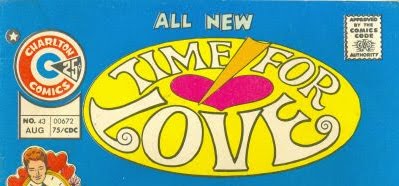
The groovy second logo was used for issue #23 (July 1971) through issue #44 (October 1975)
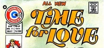
The last logo for Time for Love was only used for issue #45 (December 1975) through issue #47 (May 1976)
I am having a hard time choosing which Time for Love logo I like best. All three really appeal to me, but for different reasons. The first seems so classic, feminine, and well, romantic. The second is totally boss with its literal interpretation of the title, and the third just seems so '70s -- and I love it for that reason alone. I can't choose, so I won't even try! Do you prefer one over the others?